Demo App Operational Manual
1. Introduction
1.1 Purpose of This Manual
This manual provides instructions on how to use the demo for the "Robustizing Supply Chains" technology.
1.2 Prerequisites
- An account for the Fujitsu Research Portal is required.
1.3 Operating Environment
- Recommended browser: Google Chrome
- Recommended screen resolution: 1920x1080 (Maximize browser for optimal viewing)
1.4 Notice
- Please avoid using your browser's back button during operation, as this may lead to unexpected behavior.
2. Procedure
2.1 App Selection
Clicking the "Demo App" button at the bottom of the "Robustizing Supply Chains" technology description page on the Fujitsu Research Portal will display the following app selection screen.
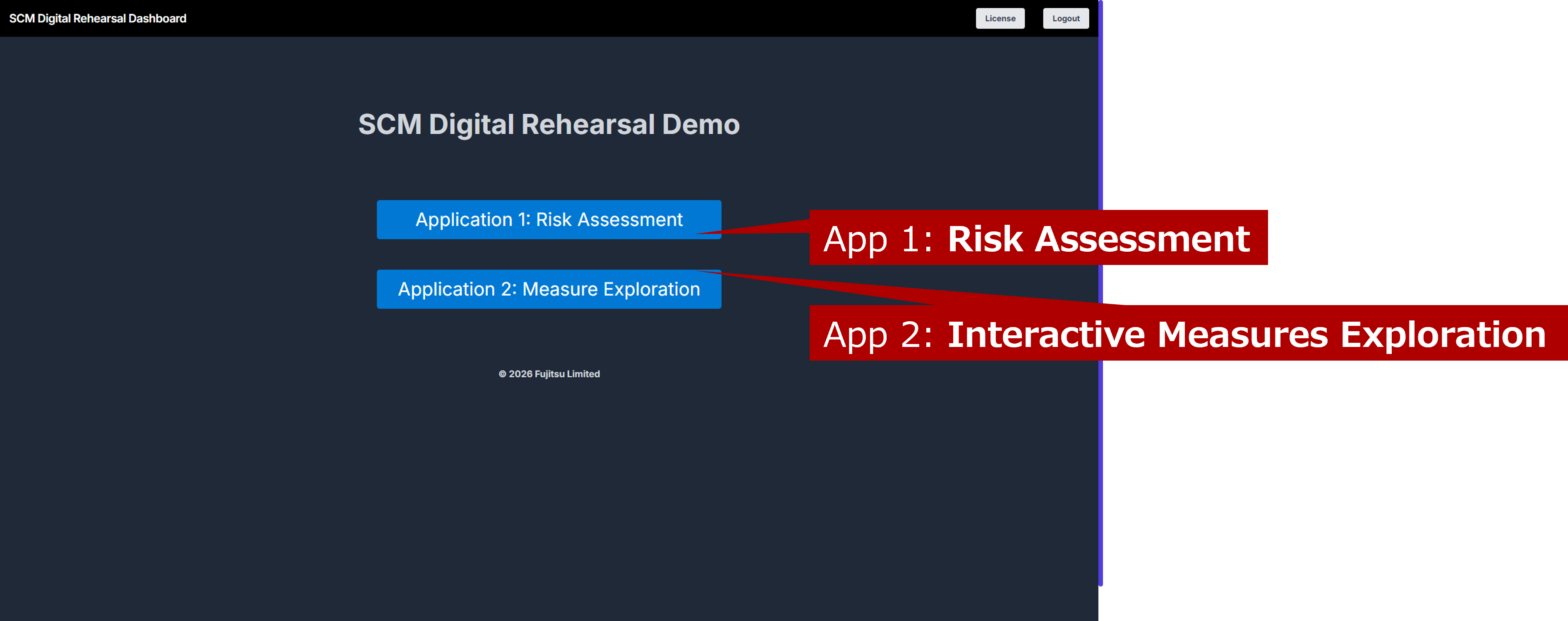
This app allows you to experience supply chain Risk Assessment and Interactive Measure Exploration to examine the impact of risk scenarios and explore countermeasures for their mitigation. Please select one of the two options to begin.
2.2 Risk Assessment
Risk Assessment allows you to set up various risk scenarios and examine how they might affect the supply chain.
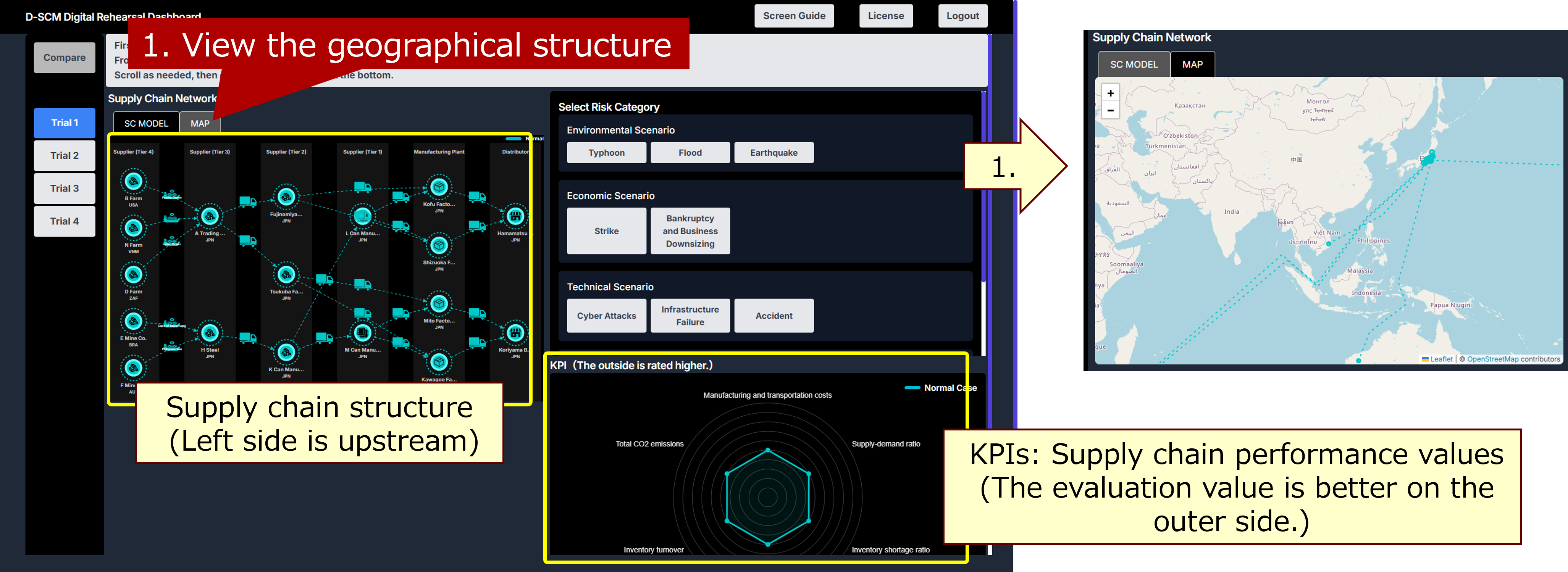
1. Understanding the Normal State of the Supply Chain
The left side displays the structure of the supply chain. You can view its geographical structure by using the “MAP” tab at the top (1). The bottom right displays supply chain performance values (KPIs), where higher values indicate better performance. The six KPIs are: Cost, Supply-Demand Ratio, Inventory Shortage Ratio, Maximum Lead Time, Inventory Turnover, and Total CO2 Emissions.
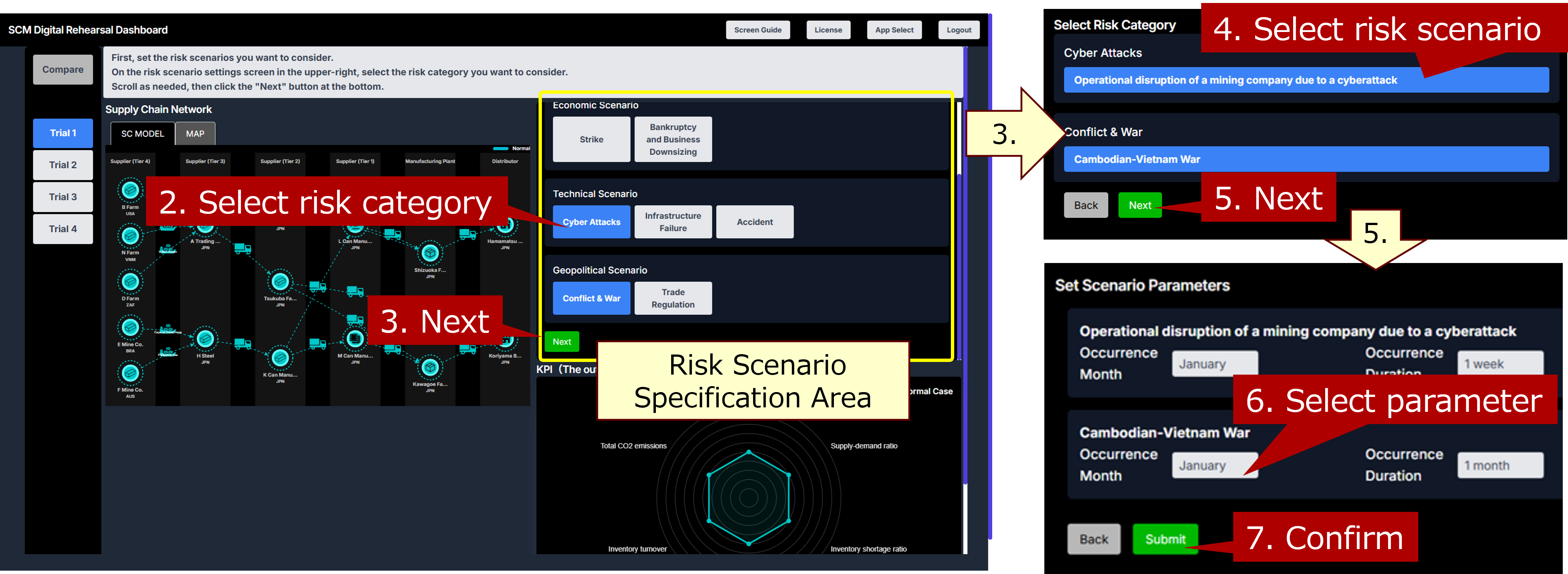
2. Specifying Risk Scenarios
Specify the details of the risk scenario in the upper-right panel. You can specify risk scenarios in the following order: risk category (2-3), predefined risk scenarios for each category (4-5), and parameters such as the timing and scale of risk occurrence (6-7). Multiple scenarios can be specified as needed.
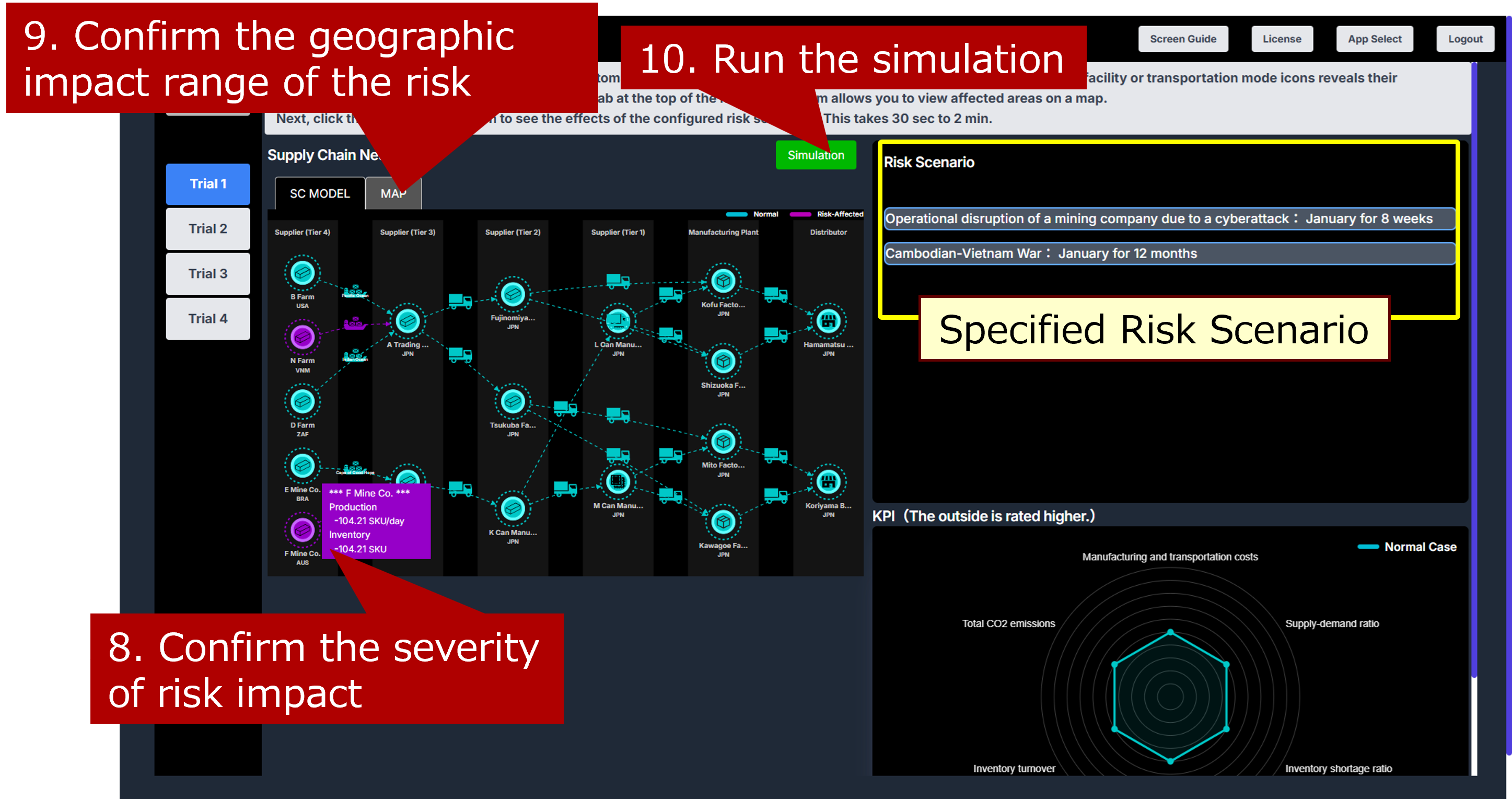
3. Checking Stress Estimation Results
The impacted areas and risk scenario severity are automatically estimated and displayed in purple on the network diagram. Hovering over facility or transportation mode icons reveals their respective impact levels (8). Additionally, the "MAP" tab, located at the top of the network diagram, allows you to view affected geographical areas on a map (9). Next, click the “Simulation” button to visualize the impact of the configured risk scenario on the entire supply chain (10). The simulation takes approximately 30 seconds to 2 minutes.
4. Reviewing Simulation Results
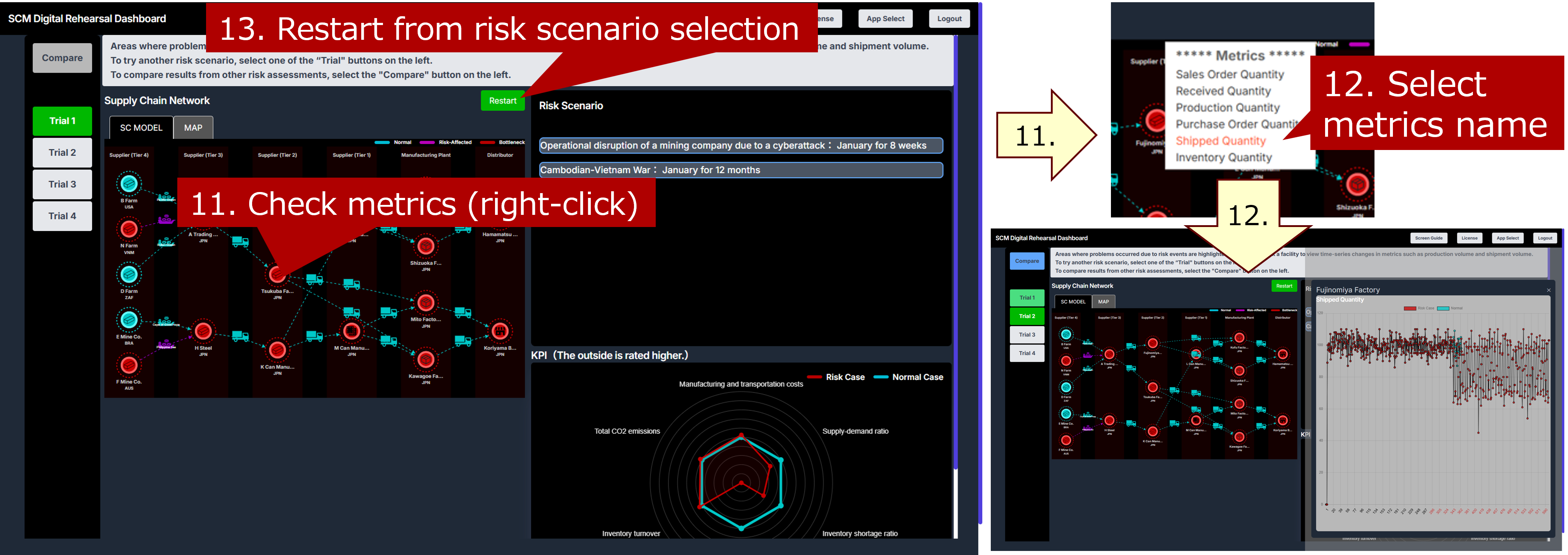
Areas affected by risk events are highlighted in red. The radar chart in the lower right shows normal KPI values in green and risk-affected KPI values in red. Right-click a base icon in the configuration diagram to view metrics such as production volume and shipment volume (11-12). Clicking the “Restart” button in the center allows you to restart the process from selecting the risk scenario (13).
5. Assessing and Comparing Alternative Risk Scenarios
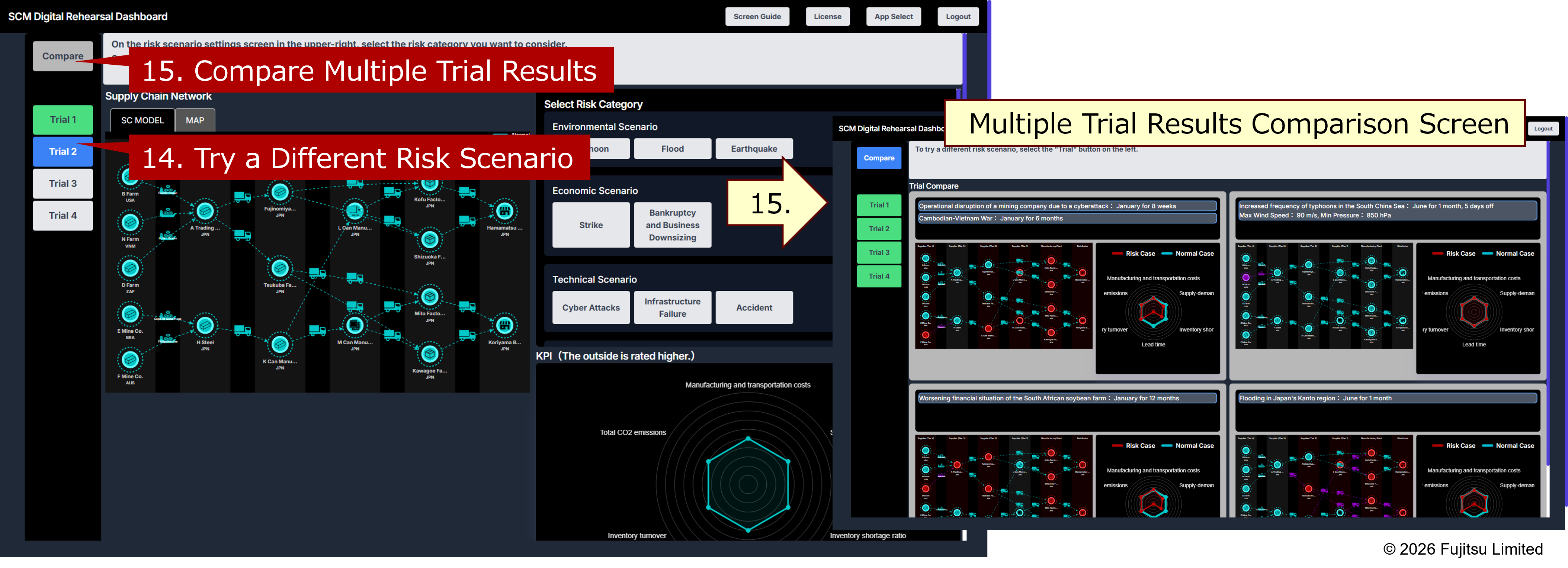
To try a different risk scenario, select the “Trial” button on the left (14). Subsequent operations follow the steps described from "1. Understanding the Normal State of the Supply Chain" to "4. Reviewing Simulation Results". Assessment results that have not yet been calculated appear gray, while calculated results appear green. If you have performed two or more trials, you can compare the results using the "Compare" button (15). Up to four assessment results can be compared simultaneously.
2.3 Interactive Measure Exploration
Interactive Measure Exploration allows you to select risk scenarios, explore them, and determine improvement measures to mitigate their impact.
1. Risk Scenario Selection
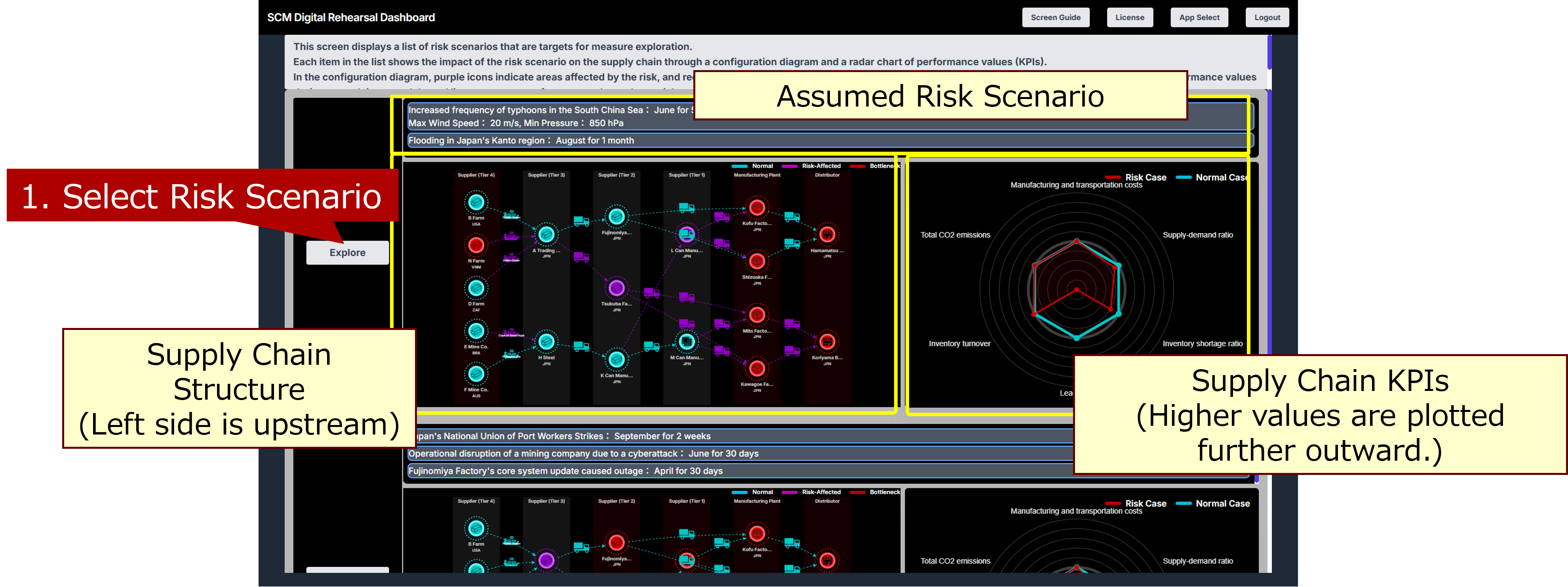
This screen presents a list of risk scenarios for exploring countermeasures. Each item displays the supply chain impact of a risk scenario through a configuration diagram and a radar chart of performance values (KPIs).
In the configuration diagram, purple icons denote areas affected by the risk, and red icons indicate points where problems have occurred. The radar chart illustrates performance values: the green line represents normal operating conditions, and the red line shows performance when the risk occurs.
First, select the risk scenario you wish to explore (1).
2. Countermeasure Exploration and Detail Review
The Parallel Coordinate Plot on the left displays a decomposed radar chart of measures, with each vertical axis representing one of the six KPIs.
A red polyline corresponds to a discovered measure. By selecting a red polyline (2) and clicking the “View Details" button (3), you can view the measure's details. On that screen, right-clicking on a site icon allows you to check time-series changes for metrics such as production volume.
A blue polyline represents a predicted measure; repeatedly exploring will help discover similar measures. Adjust the KPI sliders (4) to the desirable range and click the “Explore Further" button (5) to discover additional countermeasures that satisfy the specified conditions. If all possible measures have been explored, the “Explore Further" button will not appear.
After several rounds of countermeasure exploration (4-5) and once improvement measures have been finalized, select the red polyline for the chosen measure in the Parallel Coordinate Plot and click the “Decide Measure" button (6).
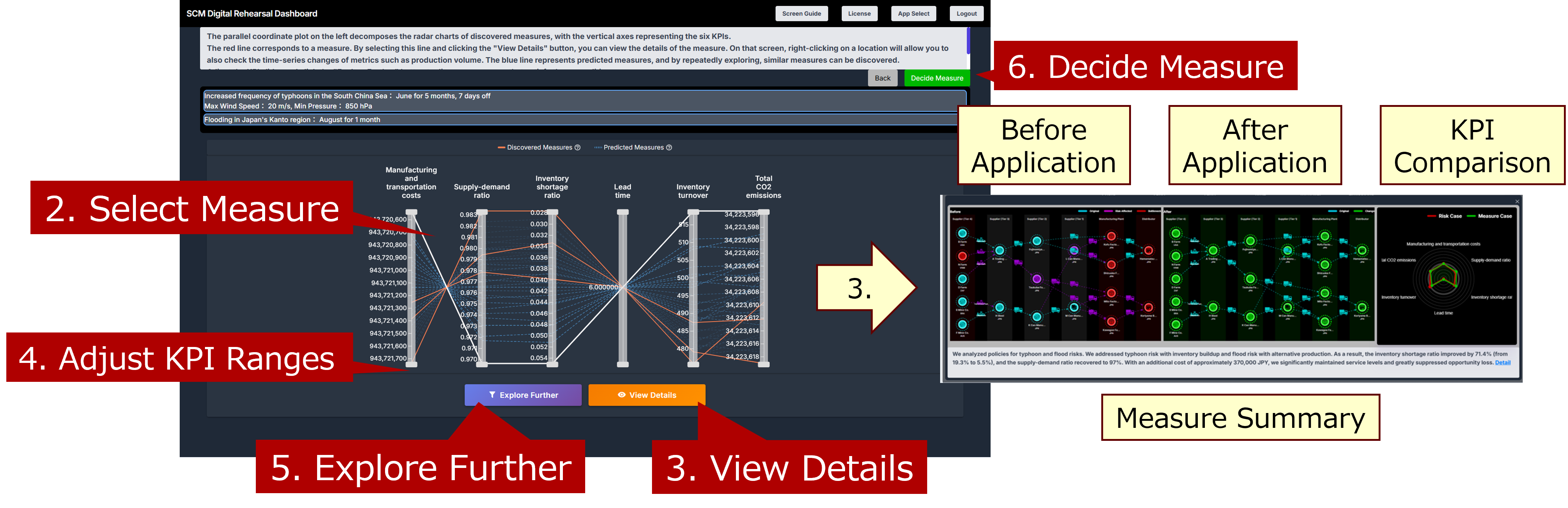
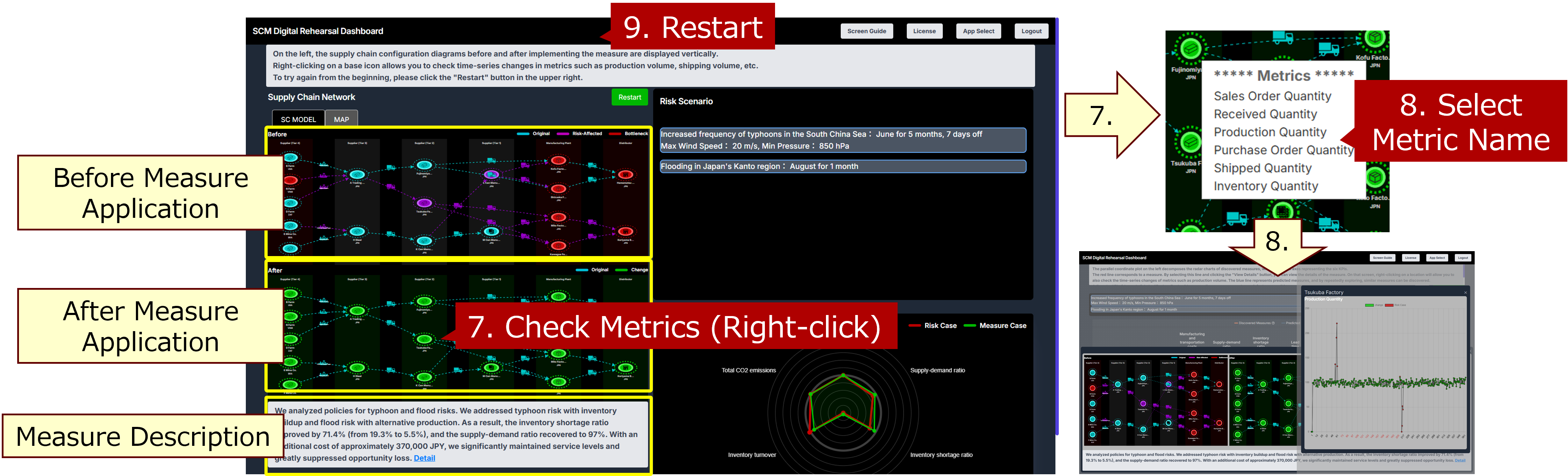
3. Confirming the Decided Measure
On the left, the supply chain configuration diagrams, both before and after implementing the selected measure, are displayed vertically side-by-side.
Right-click on a site icon (7) to view time-series changes in metrics such as production volume and shipment volume (8).
To start over, click the “Restart” button in the upper right corner (9).